Sunday, 28 April 2013

Still life painting tutorial

A very simple subject this time for my new still life oil painting: here's a still life painting tutorial of a piece of bread and a small milk jug on cloth. With this still life painting I want to go back to basics and spend some decent time observing and painting light and dark. I also want to bring back some drama and contrast in my still life paintings and create something people wouldn't mind having on their wall!
Below is a still life painting tutorial and update on progress on this painting.

Setting up
The lighting is traditional, coming from the top left. This is the first time I've used my new Daylight table lamp, which of course produces daylight-like light and warm shadows. I've used a piece of cardboard to cast a dark shadow across the bread, an idea picked up from LoriMcNee's "3 Tips to Set Up & Light a Still Life Painting" youtube video. Using chiaroscuro, I can achieve high contrast and drama in my still life painting.


Sketch on linen
I'm using a 24x30cm Belle Arti linen canvas (although I may restretch it to a 20x20cm format, not sure yet). I really like the Belle Arti fine linen range, as the weave doesn't distract from the still life subject and it's a delight to paint on.

Following a few thumbnails and moving the bread, jug, lamp and piece of cardboard around to find the right composition, I sketched the setup onto the linen. I paid attention to the rules of perspective.


 Starting the painting process: tonal/value study

What followed is the most exciting stage of painting a picture, for me anyway. Taking my time, I'm now working on the underpainting, creating proper tonal ranges (value study) and mapping out the composition. Since the colour of the bread is a red, I decided to paint the value study in a verdacchio. The use of verdacchio, a greenish-grey tint, was very popular in Renaissance times and was described by Cennino Cennini, in his 'Il Libro dell' Arte' (The Craftsman's handbook). These days some of the suggested pigments (e.g., white lead) can be replaced, resulting in the following palette:
  • yellow ochre
  • mars black (a fast-drying black)
  • titanium white


To make sure this first layer is lean to prevent cracking later on, I used Zest it oil paint dilutant. I use Old Holland oil colours.


Colour layers and glazing

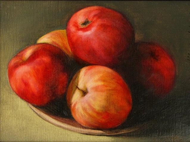
I spent a lot of time slowly and carefully layering colour in this step. My palette for the bread consisted of raw umber, flake white, yellow ochre, burnt sienna and phtalo blue (Old Holland oil paint). For this part of the painting, instead of blending the mixtures, I dragged, dabbed and scumbled the paint. To soften the appearance of the cloth, I added some of the colour used in the bread. The jug has a glaze of ultramarine blue.

I've put the painting in our lounge so I can find out over the next few days what I need to do to improve it. There is a danger of overworking the painting, especially the bread.

Tanja Moderscheim_Still life with bread
The still life painting tutorial continues soon!
Check for updates on this still life painting tutorial soon! (and keep and eye on www.dutchoils.com!)


The Dutchoils April 2013 painting newsletter

Welcome to the April ’13 Dutchoils newsletter!
Much to report in this month’s newsletter: the upcoming Richmond ARThouse Open Studios Festival, the recent sale of four still life and wildlife paintings, and I’m excited to now have art prints and greeting cards available thanks to my new Canon MG8250 printer. This month I’ll also be screen printing to try and produce beautiful textiles for the kitchen & home and I’ll be sketching at Kew Gardens.
A special offer is included at the bottom of this newsletter!

ARThouse Open Studios Festival, Richmond:
21-23 and 28-30 June
ArtHouse logo
http://www.richmond.gov.uk/arthouse_open_studios
(Information on participating artists and the festival brochure will be available on this site early May)

This Open Studios Festival is an exciting opportunity for artists to open their homes, studios, classrooms and gardens and showcase a wide range of artwork created in the local area to the public. It is an annual event; apparently 2012 was the biggest festival yet with over 80 individual artists, 12 artist and community groups and 7 schools. I believe that 90 artists will be taking part this June.
This year's Open Studios will take place over two weekends in June: 21 - 23 and 28 - 30 June in venues across the whole borough of Richmond. I’ll open up our conservatory and garden and my paintings, drawings, art prints and cards will be for sale. I also hope to have screen printed homeware available. There will be tea and biscuits and also some great discounts! Check my ARThouse page for info on visiting times or contact me.
The festival kicks off with a group exhibition from 1 June – 27 July at the Riverside Gallery in Richmond town centre. It will be an ideal opportunity for a sneak peek at what everyone has to offer, so pop by for a glass of wine during that first week.

Latest paintings sold
I’m delighted to report that I sold two more paintings through Suzie of Hill Rise Framers & Gallery in Richmond: “Still life with cherry tomatoes and blue cheese” and a painting of a puffin. Both paintings are oil on linen and had been on display in Suzie’s window. They were sold for £250 each. Well done, Suzie!
I also sold two paintings at the latest Twickenham Art Circle exhibition (11-14 April): "Winter bird" (framed, £100) and "Still life with plums" (unframed, £150). Was delighted to see that my greeting cards and mounted art prints were popular as well; three prints were sold at £25 each. To me this indicates that people like to take away an affordable piece, rather than having to spend more money on a painting. As always the art group did well during this spring exhibition in Twickenham; a big thank-you to the organising committee.


New! Art prints and greeting cards
My husband gave me a shiny new Canon PIXMA MG8250 printer for Christmas and I can now offer reproductions of any of my pieces. The MG8250 printer produces high-quality prints; I use heavyweight (350 gsm) Hahnemuhle fine art paper, which has a warm, natural white colour and a traditional etching paper surface structure. Greeting cards are blank inside with the image printed on the glossy outside, which is an archival photo surface. The Canon pigment inks are part of the Chroma Life100 system so reproductions will last for a long time. Please contact me if you’re interested in prints (typically £25-30) and cards (£2.50; also available in multi-packs). Prints can be delivered in suitable mounts and cards come with a C6 white envelope wrapped in cellophane. Cards and prints will also be available to buy through my shop page (Paypal). Free P&P!
Baby rabbit_

Screen printing kitchen & homeware
If I may say so myself, my botanical work would look nice on textiles for the home. Since I like the craft-like quality of hand-printed cloth, I have bought screen printing equipment and will be using a photographic emulsion method which allows me to print fine line and halftones. The plan is to initially produce tea towels, napkins and aprons featuring fruit, vegetables and flowers.

Plum 

Sketching at Kew Gardens
Now I have a wonderful new baby to look after, I’ll wheel him to the Palm House at Kew Gardens this month to produce some new botanical work. Some of this will then be screen printed onto textiles for the kitchen & home. Keep an eye on my blog (www.dutchoils.com/painters-blog) for progress!

Upcoming exhibitions
11 May: Richmond May Fair - in the Richmond Arts tent!
17–19 May: Richmond Art Society, Landmark Arts Centre, Teddington
21–30 June : ARThouse Open Studios Festival, Richmond
1 June–27 July : ARThouse group exhibition, Riverside Gallery, Richmond
10 June – 10 August : Llewellyn Alexander Gallery, Waterloo, London

Offer of the month (2 months, really)
For the months of April and May 2013, I’ve reduced the price of a mounted art print to £20; please contact me with the artwork of your choice (pick from www.dutchoils.com). Free P&P!

Thursday, 25 April 2013

Why it is a good idea to keep a notebook

I regularly flip through my little notebook (which I have with me at all times) and every time I find that keeping a notebook is a great way to keep up the good practice of drawing regularly, form ideas, think about compositions and find inspiration. Below are a few examples of sketches on the go, drawn while travelling through the English countryside, in Canterbury Cathedral, Dover cliffs, Paris etc. (see also the Landscape Paintings page of the www.dutchoils.com website).


Monday, 20 June 2011

No Legwork


After the thorough preparatory work for the last blog entry, a still life with melon, I decided to just paint wet-in-wet (without doing any thorough thinking, detailed drawings and value and colour studies) and see where it would take me. Paul had just bought two bags of braeburn and gala apples, and I thought that the deep red of the apples would make a great painting. So, like a headless chicken I just went on with it.

I set up some lighting and the only plan I made was to make a chiaroscuro-type painting, using a classical palette of cobalt blue, ultramarine blue, alizarin crimson, permanent rose, scarlet lake, lemon yellow, cadmium yellow light, and the earth colours burnt umber, yellow ochre and terre verte. I did take 30 minutes or so to think about and premix several colours. I decided on a rich dark background (ultramarine blue + burnt umber) turning to an airy green in the foreground (cobalt blue + yellow ochre; a colour Vermeer liked as it provides depth). The red of the braeburn apples was close to permanent rose, which replaced the usual cadmium red in my palette.

To stay in a fast frame of mind, rather than a detailed drawing, I did a quick sketch of the apples.


Still trying not to think too much, I painted fast and two hours later I ended up with a near-finished painting. I'm pleased with the result as I managed to keep the brushwork free which is a contrast with my usual style. I ended up with a refreshing piece of work (for me anyway), feeling I had achieved something. This surely was a breeze compared with the weeks I worked on the melon painting, and this freedom clearly shows I think. Perhaps I should do more of this more often - will need to see whether people prefer this style to my slow-moving usual style.

At least I can now give back those apples to Paul.

Thursday, 31 March 2011

Trying my luck


Yesterday I dropped off two paintings at the Royal Academy of Arts at Piccadilly in central London, hoping I’ll be allowed to participate in the RA Summer Exhibition. This is an exhibition open to anyone and has been held every year since 1769, without exception. Around 10,000 works (including paintings, sculpture, photography, film) representing some 5,000 artists are entered each year, of which around 1000 pieces are selected.

Now, 242 years after the first Summer Exhibition, I decided to be bold and submit my paintings. Considering that great artists such as JMW Turner and Thomas Gainsborough participated in this very exhibition in the past, it would be an honour just to be accepted. So off I went, having wrapped two paintings in a combined 10 meters of bubble wrap.

Fortunately I managed to fit the fairly large paintings (the largest is just short of a meter) into my car and, to avoid the congestion charge of central London I parked near a tube station and dragged the paintings into the Piccadilly line. The rain, when poking my head above ground at Green Park station, was not much of a problem as the bubble wrap protected my paintings nicely.

Living just outside London I noticed that I had missed the hustle and bustle of central London, black London taxis and people in suits running about Piccadilly and the curved stately architecture of Regent Street. The rain made everything look silvery black and sleek. Looking around I spotted other people carrying paintings, hurrying along to the east entrance of the Royal Academy. They seemed to be wearing blinkers, jogging nervously, almost pushing their way through to get their precious paintings to the drop off point in time (which was funny since the deadline for submission was still one and a half days away).

On my way through Burlington Arcade I ended up chatting to a man who had travelled from outside London to submit his abstract painting. He was wearing the most fantastic green/pink knitted hat. While queuing at the east entrance, I told me that he had submitted a painting two years ago which had been rejected. I wonder how many of us in the queue would be disappointed this year; it probably best to expect to be rejected. Interestingly, at that point flyers were being handed out inviting us to submit our works to an on-line gallery if the RA says NO! ... Keeping our spirits up, we made jokes about the great JMW Turner possibly queuing up right here for the 1790 Summer Exhibition, while shuffling along below statues of the royal academicians Linnaeus and Galileo.
Not much later we entered the submission hall, which resembled an ants' nest and was packed with wanna-be artists like us, unwrapping their paintings. RA staff then scanned each piece and the art handlers took the works away. And, just like that, we found ourselves outside again.

The RA will complete their selection at the end of May. Fingers crossed...!

Saturday, 26 March 2011

Life Drawing Activities

23 March 2011
I go to a life drawing group on Saturdays. Typically there are about 10 of us with some people attending every week; some are professional artists and others, like me, hope to fit in the category emerging artist. We sit together in a bright tall room in a big Victorian house in the leafy St Margarets suburb of London, and a different female model turns up every week. We draw and paint, while listening to the BBC Radio 3 classic music station. From time to time you can hear music filtering through from a room down the hall where young girls attend ballet lessons. The light dappling in through the big windows is magnificent, especially on a sunny day.
When we're done shuffling about the room, making cups of tea and looking for milk in the community fridge, Alan calls out and we gather in the drawing room. The model, beautifully lit by the sunlight, typically starts with two 5-minute poses. This is a great warm-up exercise and pushes us straight into putting the gesture of the model onto paper quickly.


The model rarely poses for longer than 10 minutes, which is great if the pose doesn't work for you (for example due to the angle from where you are working), but a race against time to record what you want if it is a perfect pose.

The group has a preference for classic poses and the models are experienced enough to know what we're looking for. Last Saturday, our model was an actress and was obviously aware of aesthetic ways to stand and twist her body. As each model visits us every few weeks, we get used to their bodies (shapes, curves) and after a few sessions it becomes easier to draw them.
Time to choose which drawings can be put onto canvas! The drawings and work in progress can be seen on the Dutchoils website.